12 Website Conversion Rate Optimization (CRO) Quick Wins
Written by
Are you desperately searching for a way to get more leads from your company’s existing website visitors? If driving traffic higher isn’t helping you drive your average conversion rates along with it, it’s time to look at amplifying your CRO strategy.
It’s true that inbound and CRO marketing is a long-term commitment. But that doesn’t mean there aren’t some quick-win opportunities to increase your website traffic and conversion rates. Let’s dive right in and tackle the top 12 CRO marketing quick wins for inbound programs.
1. Experiment with Call-to-Action (CTA) Placement
CTAs tend to land at the end of a blog post or at the footer of a web page. Whether it promotes your blog subscriptions, new landing pages, or simply encourages a contact, adding CTAs near the top of your website or “above the fold” can help increase conversions. Experiment with other locations, too: the middle of a webpage, on the sidebar, as pop-ups, etc... anywhere that’s relevant.
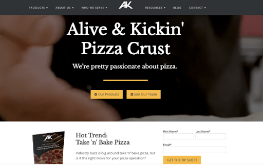
While placement is flexible, make sure to use visual CTAs that stand out to get visitors interested in what you have to offer. You only have a few seconds to grab readers’ attention!
2. Add a Blog Subscription Sign-up
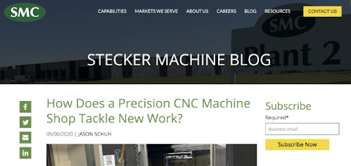
Encourage visitors to subscribe to your blog by offering short subscription forms on your blog pages. This could be on the sidebar, at the top of the page, or even as a slide-out/pop-up (more on these later) to get visitors’ attention. Keep the sign-up form simple: don’t ask for more than their email address and maybe their name.
3. Gate Your Most Valuable Resources
Before even starting an inbound program, many industrial manufacturers offered free advanced content (PDFs typically) on their sites, but they weren’t gated. Gather those ungated resources together, including:
- Whitepapers
- Guides
- Case studies
- Technical sales presentations
- Trade show decks
- Research (or any other type of advanced content)
Now, determine which will be gated and consider building landing pages for each, requiring some basic contact information in exchange. Sometimes valuable information is in a blog or pillar page. If it’s getting high traffic, consider presenting the information as a gated PDF. At the least, offer a “take this resource with you” option, or a “get the complete guide” CTA.
RELATED: 10 Inbound Marketing Landing Page Guidelines to Maximize Conversions
4. Optimize Promotional Email Sends
When thinking about ways to increase the number of people who fill out a form on your website, don’t forget about the emails that might direct them there. Optimizing emails that promote content offers is directly tied to improving your conversion rates.
If you’re disappointed with an email’s open rate — say, 5% — it’s easy to dismiss it and think it didn’t work. Look critically at your subject line and ask how you might improve it to make it more engaging and “click-worthy.” Also, look at sending on different days and during different times of the day. Was it sent on a Monday morning and history tells you there’s better engagement on a Tuesday afternoon?
A couple weeks after the initial email goes out, make appropriate adjustments and resend the optimized version only to those who didn’t open it the first time. Even if the second time around results in a handful of conversions, it could be well worth it.
RELATED: 5 Steps to Power Up Your Re-engagement Email Campaigns
5. Include Video
A sure-fire way to increase engagement is to include video as part of your promotion. There are plenty of statistics that prove video’s effectiveness, so it definitely needs to be part of your B2B strategy. If you’ve already created a video that’s tied to a content piece, be sure to include offers within the video, such as a request-a-quote button or a link to a related landing page. Or, consider creating a video with a message that directly introduces and promotes an offer.
Some may not consider video a “quick win” because they imagine a production studio, expensive equipment, and a carefully crafted script. Yes, it’s important to invest in video production or animation for complex products, solutions, or recruiting when called for, but there are times when a simple on-camera interview or introduction with a few edits can do the trick.
6. Create Tailored CTAs for Mobile
Graphic CTAs are commonly designed with a desktop user in mind, but they often contain more text — and smaller text — than can easily be viewed on a mobile device. One way to boost mobile conversions is to simplify your CTAs down to three keywords with a brief offer and a crystal clear “Access Now” button. Streamline your copy as much as possible; larger words and fewer of them will stand out.
Consider your CTA’s design aspect, too. Use vertical CTAs instead of horizontal so they fit better on mobile devices. It’s important to examine how much traffic you see for mobile vs. desktop and the conversion rates for each.
If your mobile traffic converts less than your desktop users, redesigning your graphic CTAs may bring better results.
7. Add Inline Featured CTAs
Think you can’t optimize a top-performing blog any more than you already have? Take a look at heat mapping to see where most people are dropping off. Then, consider adding a related inline CTA in that portion of the post to keep them engaged or redirect them rather than clicking away.
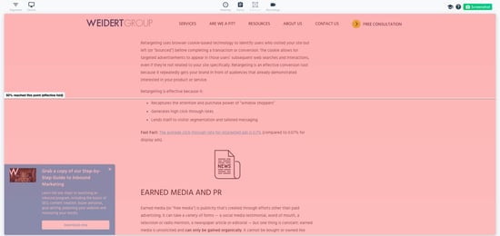
With a little more know-how, you can also embed an inline form so a viewer doesn’t need to leave the page to convert. Keep this form short and sweet so that it doesn’t feel obtrusive when scrolling down the page. Inline CTAs help readers by providing relevant content earlier on the page rather than having to scroll through the entire article before they get to a footer CTA.
8. Simplify Your Forms
If you require prospects to fill out lengthy forms with too much information, it could be a barrier to conversion. Look at ways to shorten your forms to only request information that’s absolutely necessary. If you have eight questions, try cutting it in half or down to only six. It’s a good experiment to see whether you start getting more conversions.
If you believe you really do need all eight of those questions, try a two-step form where a user fills out a portion of the form and is then triggered to complete the other fields on a second page. Be careful, however, to not get too complicated (and annoying).
9. Deploy A/B Testing on Landing Pages
Similarly to A/B testing for emails, isolating and tweaking one element on a landing page through multivariate testing can help determine what creates greater interest. For example, create an Option A landing that has seven form fields and an Option B with 4. Or, you could change up a headline, design element, or the amount of text. Keep the differences between the two simple, and monitor them over a set period of time before choosing the winner.
RELATED: Effective A/B Testing Best Practices for Your Website
10. Optimize Your Thank You Pages & Follow-Up Emails
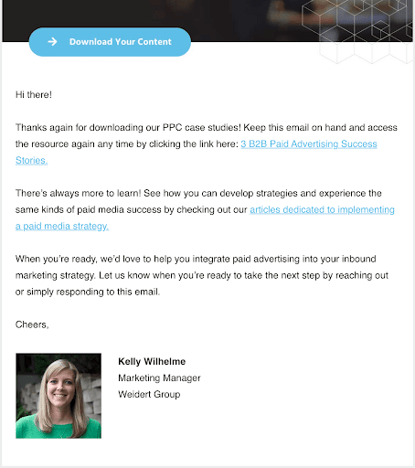
A Thank You page or follow-up email means you’ve already captured a lead’s contact information, but providing secondary offers could help a prospect take the next step in their buyer’s journey. What about offering a related content piece or a free assessment or sample? Try to think outside the box to help your leads take the next desired action.
11. Use Pop-Ups Wisely
When you think “pop-up,” you may not get a fuzzy feeling. But, wow, can they crank up your conversion rates when used properly. HubSpot’s pop-up form building tools can take shape as a true pop-up, drop-down banner, or a slide-in box from the left or right. They can be triggered by events such as exit-intent (when someone is about to close the page), time on page, or the percentage of a page scrolled.
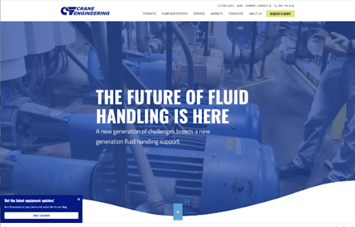
Some people aren’t fans of pop-ups because they feel intrusive, but that opinion could change if they’re truly helpful. For example, a drop-down banner could appear when someone reads a blog inviting them to subscribe. An exit-intent pop-up could urge visitors to take action before leaving your site. A slide-in box could offer a PDF version of an article.
Pop-ups create a new lead flow and can be optimized to promote your blog, encourage newsletter sign-ups, offer advanced content, and more. Look at the structure of your site to see which type of pop-up is most appropriate, and steer away from those that will cover important content.
12. Offer Chatbots as a Low-Friction Conversion Tool
Artificial Intelligence (AI) programs are everywhere. When used on your website in the form of a chatbot, they can simulate conversations, answer questions, eliminate friction, handle concerns, and automate many tasks related to serving and engaging with visitors.
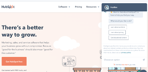
Where a form might fail to capture information, chatbots could help boost lead conversions. Based on the answers received from visitor questions, a chatbot can ask lead-qualifying questions that you’ve predetermined and directly connect prospects with your sales team.
Chatbots can also be used as a simple tie-in to a new content piece. Remember that promotional email you sent? Once they click through to the offer, a chatbot can greet them. Likewise, when a contact in your CRM visits other select pages, a chatbot can suggest customized offers based on their contact criteria, interests, or other related offers they’ve downloaded.
Keep these types of chatbots simple: a button to click “yes” or “no” should suffice. Since you already have their contact information and can leverage smart content, they won’t have to fill out a form again. Program the chatbot to open any offers in a new tab so that prospects can pick up where they left off.
We hope these tips help you earn some quick wins and boost lead conversions on your site! And since you’re interested in improving your content and website, explore the advantages of growth-driven design, the more efficient and productive method of building and maintaining a website.
Subscribe To Our Blog
Information. Insights. Ideas. Get notified every time a new Weidert Group blog article is published – subscribe now!
You May Also Like...

Search Engine Optimization
Zero-Click Marketing Raises the Bar for Good Marketing
Weidert Group News & Events
Experience Inbound 2026 Opens Registration for Wisconsin’s Premier Marketing & Sales Conference

Search Engine Optimization
Zero-Click Marketing: What B2B Marketers Must Rethink Now
Accelerate Your Growth with
Weidert Group
If you’re ready to explore a partnership, request a personalized consultation with our team.

